Showing posts with label Digital Art. Show all posts

Sometimes Wedding Bells Sound More Like Thunder Claps

Monday, March 21, 2011 | |

Weddings are fickle things. They are important but silly all at the same time. They are kind of like birthdays in a way. I don't feel much different on or after my birthday, but the ticker that keeps track of my life has seemed fit to increase by one. After a wedding, is anything really different than before? I don't think marriage makes you care for someone more or love them more, but the way people treat weddings, you feel like you ought to.

I maintain a wedding is just a big ass party; I don't think you can deny that. Sure, there's a ceremony, but the bulk of a wedding is the reception-- that's the part people have fun at, the part people remember. Do people really remember a ho-hum ceremony when the DJ rocked some pretty phat beats courtesy Kenny G? I highly doubt it.

So it seems silly that for what is essentially a gathering of people, strongly resembling that of a party, has so much pressure put on it. Even more weird is that, most weddings are pretty much the same, formulaic bullshit. No offense to anyone who opts for such a wedding, some people love tradition, I respect that. I just think people should shake things up a bit from time to time.

I don't know if the best way to manifest that is by playing the Sex Pistols at a wedding, though. Just sayin'

There is definitely a weird aura that surrounds weddings and their planning, though. Everyone has an opinion. Most of those people, of course, are the ones who pay for weddings, so their opinions tend to find themselves grounded more in fact than opinion, though. This can be kind of stressful at times though, when the same people are telling you to do what you want to do in one breath, and the next don't seem too thrilled by your choices.

Like rings. Engagement rings aren't really necessary, are they?

Apparently to everyone else they are very important.

A song which will likely be played at the wedding:


This is pretty much verbatim what went down buying a suit. Some words may be slightly off, but I could not understand the tailor at all. Personally, since she was a woman, I think she is a seamstress. To me, tailors are men.


The salesman dude reminded me of an amalgamation of a whole lot of people. I actually quite liked him, though. He wasn't very pushy (until the end, but that's okay, I guess). He was more than patient, gave us space, and didn't mind being playful. Salesmen are all too often far too serious. I know, I used to be one and worked with a bunch of them. Pushy little fuckers. That company is out of business now though, so it serves them right. He had a kindness about him though, sort of Tim Gunn-esque. Just not as fabulous.

Prairie dogs. Need I say more?


Pronghorns. Their horns are unlike that of other horned animals. They actually shed their horns every year. They are also bone, which is covered in a sort of hair-like furryness.


Pygmy marmosets. Pretty much Krissy's favorite animal ever, so they had to be included. The Howler Monkeys are rather fun, too.

Apparently, dinosaurs are not appropriate. I think the dinosaurs and zoo animals would get along just fine. A rather large group of people are under the impression that humans and dinosaurs once coexisted peacefully, so I think they'd get along with peacocks as well.


Seating cards. If we could do it the way I'd want to (in an ideal world) they'd be flawless and seamless. Since we lack the right kinds of equipment and expertise and junk, we'll have to settle for adorable and still pretty kick-ass.


Where the whole shin-dig is going down. This picture is so pro. I should get paid for this kind of thing.

What's nice is that the walls are wood, so any light ends up with a very warm color temperature.

Hanson Exploration Station

Peacock! They just roam about. There are at least five of them. This one is particularly pretty.

Peacock At The Beardsley Zoo

In the end, any stress really isn't worth it, though. Minuscule details, even if not perfect, will probably be forgotten. What people will remember is if the day was fun, if they enjoyed themselves, and hopefully that the day was a bit different.

Adventures In Advertising: The Dark Side

Sunday, February 6, 2011 | |

Some people think of advertising as an annoyance, while others think of it as an art. Still, to others, advertisements are more sales tactics than anything approaching art. Me personally, I'm somewhere in camp one and two.

One one hand, advertisements really can be a nuisance at times. Does anyone really enjoy looking at sixty pages of advertisements just to get to the table of contents? I actually enjoy looking at the photos, but since they do not change from one magazine to the next, it gets old fast.

Then there's the whole "advertorial" bait and switch. You're reading what you think is an editorial, and it just sounds a wee bit...lofty. Magazines are rarely that generous with their compliments, so something must be up. And indeed, there is something up. Advertorials are written by advertisers to look like they were written by the editors of the magazine. Beauty magazines and other decidedly female magazines are probably the worst offenders I've seen.

But then, advertisements really are an art form. Consider that you need to convince someone to buy something with nothing but a photo, or a thirty second video. If they are already a customer, you're set, but how does one convince a non customer to buy your product with just a photo, or short video?

Then of course there is the production that goes into advertising. Setting aside the fact that the end result is to, hopefully, sell a product, advertisements are kind of beautiful. With some exceptions, most of the photos in advertisements are top-notch and they should be-- they pay out the ass for it. Commercials are like mini movies of their own, with presents a challenge all it's own.

Granted, by no means do I mean to imply that all advertising is equally artistic. There are plenty of ads that are nothing more than a sales pitch, and others yet are thinly veiled attempts at best. But the good ones, the advertisements that really matter and make a lasting impression as being something special, those are most definitely art.

This is one such example:


Consider a few things after watching this commercial. First, they've not only used the Darth Vader costume, but also the Imperial March. While it may not seem like that big of a deal, George Lucas isn't known for letting just anybody use Star Wars as a vehicle to sell a product. Or in this case, to use Star Wars as a vehicle to sell quite literally, a vehicle.

The ad features a child dressed as Darth Vader. This is adorable! I'm always happy to see children in roles that are a bit different. I'd be only too happy if I never had to see another ad of a throng of children rushing into the kitchen to eat an entire plate of Totinos, or some other pseudo-food. People don't give children enough credit, but they also don't let children simply be children. This is important, and what makes this commercial work.

The ad is very Volswagen. Their ads, while not terribly unique in automotive ads, are very simple and understated. This advertisement is no exception. In this case, the simplicity and understatement works flawlessly, because I think anything overly sophisticated would ruin the playfulness of the ad.

And that, my friends, is how you make an advertisement not just beautiful, but work.

My only qualm? I really, really wish there was a matching print advertisement to go along with this. For all I know, there may be, but I doubt it. Most print ads for cars just show the cars. I think this is one case where a slightly quirky, and thus different, print ad would go a long way to capturing peoples' attention, which in these times, capturing anyone's attention for more than a fleeting moment can be damned near impossible.

Below is my contribution. You can thank me (and pay me) later, Volkswagen.


I Haven't Been Feeling Particularly Creative Lately

Wednesday, February 2, 2011 | |

Creativity doesn't just flow at all times; I have to think that even the masters had their superstitions about painting. Certain times, environments, places, people, so on and so forth must contribute to how people can and cannot create. Some people need extreme organization so they can easily reach and find whatever they need whenever they need it. Others might require a slightly more chaotic environment to endeavor to creative work.

For me, I think temperature is a factor. Really, temperature is always a factor for me, one I cannot ignore but never seems to be just right. The thing is, if temperature is all that mattered for my being able to do anything creative, that would be fine. I can alleviate that. But when it is hot--when I am hot, I cease to function in the way humans were meant to. There is nothing positive about being hot, except for the prospect that the cold will come, eventually.

When I am warmer than I'd like to be, I am just uncomfortable. I'm usually uncomfortable anyway, though, so I can usually deal with it for a bit. But the warmer I get, the more and more I cannot perform the regular, necessary tasks required of me, much less hope to try and create anything interesting.

Mind you, the ambient temperature doesn't matter a lick. Quite honestly I can be outside in the snowy winter with no coat and be hot, and no, it's not hypothermia setting in. Most of the time, I'm hot, and when I'm hot I feel like this on the inside:


There is no escaping this fire that radiates from within me. It basically paralyzes me. How can one be expected to do things when your body feels like it's on fire? At least if I were a phoenix, I'd find comfort in knowing I was about to be reborn. But here? I can find no metaphor describing the intense heat I feel within.

There are so many topics I want to write about, ones I've been meaning to write about. There are even several I've already written about and just haven't posted because I'm so unhappy with how they are written. In fact, I have some written that are no longer relevant.

I had been working on a few drawings to post, but my copy of Corel Painter suffered a conniption that nearly destroyed my computer. Luckily I was able to rectify the problem, and I just have to reinstall Corel's devil suite again to finish up my drawings.

Hopefully, this drawing I did after the one above will suffice for now. It's a dwarf/gnome in a forest. He belongs in a forest, I think. Maybe one day I will draw him in a dwarf village. Also, I left him as black and white as a statement about how polarizing the world has become.

Centuries have passed since people were either black and white, and very little has changed. Sure there are shades of gray. Some of us are of mixed races. Some of us are more white than black. Some of us are completely different colors (though I hope none are green). Politicians are republican or democrat. whig or tory (right?), so on and so forth. Male or female. Democratic or communist/socialist/fascist (because some would have you believe they are interchangeable and/or the same). Religious or athiest, Funny or serious. et cetera.

Or maybe I just left him black and white so he would stand out. Yeah, that sounds more likely. I guess I am no prodigy.

In Which I Look Back At An Old Website...And Other Stuff

Tuesday, January 25, 2011 | |

I've always been interested in design and graphics, well, for at least as long as I can remember. I've dabbled in so many different programs that I feel like I'd used them all before I hit college. I remember downloading Paint Shop Pro (version 7, IIRC) from KaZaA on my brothers computer when I couldn't have been older than ten. I remember upgrading to Photoshop, though I can't remember which version. I remember a friend in my Computer Science class in high school passing along a copy of Dreamweaver and Fireworks to me at my request. It's actually kind of funny, because I still have the disc, even though Macromedia, who created the programs, no longer exists since Adobe bought them out, and because they are cust so old. Adobe released CS5 last year, which means that they are, at least, five versions past due. But it's funny to look back on it.

I remember downloading 3D Studio Max, which is a three-dimensional rendering program. If you don't know what that means, imagine Pixar movies, they are made with that type of program.

Now you might be thinking at this point about all the programs I've stolen and how I'm a bad person. Sure, it was wrong, but considering that I was like ten I feel like I probably shouldn't have the hammer come down on me too swiftly. Also, 3DS Max costs like $3,000-$6,000 if I remember correctly, not exactly in my budget at the time. Besides, I was really just taking them for a test drive, it's not like the companies were losing money from me.

I also used the GIMP, briefly. I never took to it's user interface, and I really had a problem with it's ugly name. The GNU Image Manipulator Project (that's more or less what it means). Essentially, the GIMP is Photoshop, but free and open-source. It does almost everything Photoshop does but it's supported by hundreds of people who devote their time to make it better.


In college, I quickly realized that I didn't enjoy life at school. The campus was beautiful at times, and ugly at others. There was some really awful modern looking buildings like the Javit's Center, but the campus was 1,300 acres of real beauty, marred by giant blobs of concrete. The newer architecture wasn't so bad.

Old, ugly architecture. That's a cube on stilts in back.
SBUwangcenter
The Wang Center, yes, really. It's actually an amazing building.


Anyway, at some point, I decided to make a website. Apparently, I felt there weren't enough websites around for teaching things. Most likely, I created it moreso for myself as a sort of archive of what I'd been teaching myself. I didn't know much, but I decided to put what I did know to work; besides, it was more fun than going to class.


I decided to call the website Hugging Bunnies. I can't tell you why, specifically, that was just what came out. Though, I like cute things, I always have, so I'm guessing that has something to do with the naming. My AIM screen name was always imalilchoochoo, so you can see where I might come up with Hugging Bunnies. Above is the header of the "Graphics" section. It's kind of cheesy and in no way what I would consider good or professional, but I liked it. It fit the site. Besides, I had no idea what I was doing, really. Well, sometimes I did.


This is the main page, the index, or the front page, whatever you would prefer to call it. The page looks especially cool with my custom shell for windows, which I am not going to get into, that is really, really too nerdy to discuss here.

As you can see, even then I was a tab-a-holic, always multitasking beyond recognition. I also had Dreamweaver open, for creating the site, obviously. Next to that is my AIM window, because I was always chatting to people. And I has SSH open to upload the site to my student server space. Eventually, I bought a domain and had the site hosted at huggingbunnies.com, which is now, sadly, defunct.

The website had a lot of flash, because I was trying to teach myself how to flash (*giggle*). The flash was subtle, though. I like the design though, it's very clean and streamlined. I think the big black blobs were placeholders, because they totally clash with the design. The icons are pixel-art based. I like the black and white style with the splash of aqua for the links. On the left was, I believe, random quotes made by professors and students. From what I recall, my professors had pretty good senses of humor. Some of them were just downright crazy.

I remember making a lot of desktop backgrounds. I recently came across this one. While it is very plain and simple, and not particularly special in any way, it's neat. I like blue, I always used a lot of blue, I think. Sort of how when I paint I use a lot of a certain shade of green because it seems woodsy.


Also, back in the day I was the administrator for a BBS, (basically a web forum). I don't know why I joined it, really. I think I liked the name, although the forum was far too pink and frou frou, it needed some testosterone. I remember doing lots of graphics and stuff.

Eventually, I completely overtook the site and made a few friends (and probably some enemies). I learned a lot during that time; mostly about 4chan and the annals of the internet, which is kind of ironic considering the power puff girls feel the forum had going.


I created banners and stuff in my spare time, which I had a lot of due to the whole hating school thing I had going. This one was a ninja themed one. I like it, it's neat. I'm sure there are some cliches and I'm sure it's terrible, but considering my circumstances at the time, I think it came out okay.


Pink! Although, I like this one. It's more magenta or fuchsia, which I like. And the text makes it look kind of dorky with a modern twist.


This one is tiny (at least on my screen), but it's pirate themed. I remember having a thing for ninjas and pirates back then. I'm a boy, so it comes with the territory, I suppose. But the whole ninja-pirate thing was kind of popular then, too. Not that it isn't now. It's like velociraptors, they're never not cool.


At a certain point, my friend Jote and I ran the site, but basically used it as a testing ground for other, cooler projects we wanted to start. I remember there being all kinds of random projects, and it was fun. The radio.blog was one of them. I liked creating banners back then, so any excuse to make one was fine by me. I also love music, so a radio.blog skin seemed destined to be made. This is my favorite:


I never much cared for the RIAA, because they are a horrible organization pretending to care about the musicians they pretend to represent. This was how I decided to express that frustration. It seemed fitting on so many levels. And the little boy reminds me of myself. Though, my teeth aren't that bucktoothed.

This was another header for the radio.blog. I went through a squares phase. I guess it was related to the pixel art phase, just expanded and blown up. Again, I used blue because I'm a dork and I like blue. In fact, I'm wearing a blue shirt right now.


Last, but not least, and likely not the last new old art I'll dig up and post here is this render I made in 3D Studio Max. I suppose it's only fitting that I would end up playing with and using rendering software later in college for my most favorite of all my classes: Computer Science And Art taught by George Hart. George was a really cool professor and a genius. But he was also amazingly creative, which I admired about him. In a strange twist of fate, the rendering program we used was actually Maya and not 3DS Max, oh well.

I remember doing a bunch of renders. I can't find any but this one, though. I remember spending hours fiddling with it only to have to wait hours just to render the image and see the result. Well, usually it was quicker, but the final image always took a few hours or more to render.


I like it, though. It's pretty generic, and I probably followed a tutorial of some kind, but it's kind of amazing to design something at the computer and then have the resulting image turn out so realistic. I remember doing an indoor scene, too. And I made a table, that took more time than one would think. In Maya, I remember making a character with an abnormally large head.

When we were done, one of us got to have our model made on a rapid prototyping machine, but alas mine was not chosen.It's okay though.

Despite the fact that school sucked and I hated almost every second of it, there were some bright spots in the abyss that was my time at Stonybrook.

For the record, in 2005 it was rated the second unhappiest school, and  by 2008 it had been knocked down to fourth or fifth, so I'm sure that didn't help my distaste of the whole environment any.

My Milk Manifesto

| |


I love milk. There is perhaps no truer fact in all of the world than this. I drink it almost exclusively every day. I can drink a gallon in a day if I am thirsty enough and so inclined as to drink it. Milk is the first thing I drink every morning and the last thing I drink before bed. There is little comfort in any drink other than milk.


And, for me, there is only one kind of milk: whole. Whole milk is delicious. Drinking whole milk is like lapping at a pool of heavenly dessert in liquid form. I never tire of milk's opaque goodness. Though, in these desperate times, I've relented and bought other milks because they were on sale.

My love for milk is so true, I've decided to pen a poem in its honor:

Oh milk, your snowy gaze does catch my eye
You rest above where my eggs do lie
A Day apart, I fear, brings dismal days
An eternal milk pool for which I pray
Will keep my milk monster at bay

Milk, aside from being delicious on its own, is rather versatile to boot. When added to cereal, one can sometimes hear the cereal speak to you. Added to coffee it takes is from an awful abyss of blackness to a cool brown in addition to making the coffee taste better. Milk is vital in baking, and I pretty much substitute is for anything anytime a recipe calls for water. (Except in bread and recipes where it matters.) Meatballs have a creamy texture with milk instead of water. Hot cocoa without milk is a travesty and shouldn't even be considered cocoa when made with water.

You can even get milk from animals other than cattle:


Chocolate-Goat's-Milk


Milk can be flavored with chocolate, strawberry, and maybe lots of other flavors. Maybe hazelnut, or chocolate hazelnut would be yummy. Maybe someone could make a berry milk, too.

Milk goes into ice cream (though cream is the majority), sherbet, and gelato. Milk helps create a milkshake by lending more than just its name.

Some people bathe with it, though I can't imagine wasting that much milk for non-drinking purposes.


Annie Leibovitz took a pretty famous photo of Whoopi Goldberg in a milk-filled tub for the cover of Rolling Stone.

If I could, I think I'd like to drink milk this way, can upon can into milk cans. Though, I think that is even too much milk for me, not that I wouldn't mind trying to drink it all. =)


There is much more to be said about my love of milk and other dairy products, but for now this is where I leave you.

Man Cat As Art: Chairman Meao

Monday, January 10, 2011 | |

[This is part of a continuing series:Man Cat As Art. For more like this, see Van Gogh, MatisseDa Vinci, Darger (and a couple others) and Tommy Wiseau.]

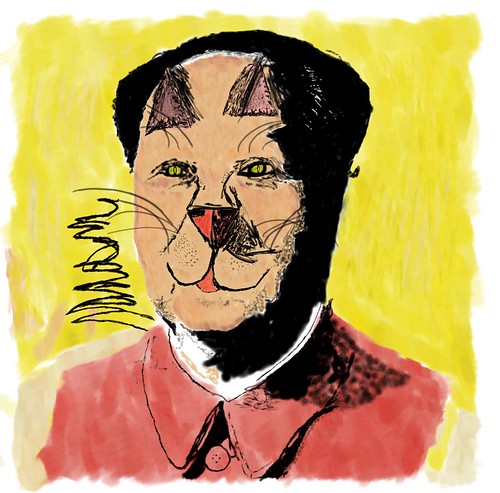
I'm still coming to terms with the fact that I cannot draw a cat. Well, I can't draw their faces. Not realistically, anyway, so be kind and imagine that this looks vaguely reminiscent of a cat. One day, I will be able to do this much, much better. That's a day I look forward to.

I don't know a lot about Andy Warhol. He lived before my time, and I was never much into art history. Much of art has passed me by in a whirlwind, and I am just now beginning to look at it, and ask questions. I'm a bit more familiar with Andy Warhol, though, because he just happens to be Krissy's favorite.

From what I have seen and read, he was eccentric, but what artist isn't. He didn't create pop art, but he is one of the driving forces behind its popularity, and what it is today. There are only a handful of artists I can recognize as inspiring other pictures or art, and when it comes to pop art, I can think of just two: Warhol and Lichtenstein.

I think I'm improving, but I think I'm going to have to take a look at cats, cat drawings, paintings, and the like, because trying to improvise kitty features is kind of hard, especially when you are trying to put them where they do not belong-- like on Chairman Mao.


Chairman Meao

In some ways, it's kind of fitting to have Mao as a Man Cat. Cats can be ferocious little beasts, and any freedoms one once had before getting a cat are soon swept out the window. In a way, all cats are little Meaos. But they do all generally have their moments where they're all curled up and cute like. That's why no cats, Man Cat included, are truly Meao Cats.

Maybe one day I can come back to this, and redo it so it looks more realistic, though. Not realism realistic; just better. I'm not entirely happy with it, especially in some parts. But overall, considering my abilities, I think I did an okay job. I don't know why I ever decided to make a project involving drawing a cat. Fur is hard (for me at least), and cats have differently shaped faces to humans too. I'm getting used to human faces, but cats are something else entirely. Maybe in doing this, I will improve on that, though. After all, if I can master drawing a cat, or at least a cat face, then that opens up a wide swath of new animals, since so many animals have that cat-shaped head, or a small variation of it.

Also, still getting used to my tablet, and using a new program, which made this take forever. I think I could have been a tad more expedient had I been using Illustrator, but it's okay. Corel Paint is kind of fun.

Anyway, I've rambled enough. This is my drawing of Man Cat as Art: Chairman Meao, inspired by Andy Warhol. And some of my randomly random thoughts as they came to me concerning it. I hope you enjoyed them.